The warm whites, creamy beiges, and rich greiges that give a home that quiet, expensive, “professionally designed” feel — without a single loud color on the walls.
Have you ever walked into a home that just felt expensive — even though the walls were technically “beige”? That’s not an accident. Luxury interiors almost never rely on bold, statement colors. They’re built on warm neutrals: soft, layered shades with depth, subtle undertones, and a quality of light that makes everything in the room — the linen sofa, the brass sconce, the marble counter — look richer than it is.
This is the heart of the “quiet luxury” look. Instead of shouting, these colors whisper. And Sherwin Williams happens to make some of the finest whisper-quiet neutrals in the business — the exact shades designers use in high-end new builds, boutique hotels, and magazine-worthy renovations.
Below, I’ve curated 17 Sherwin Williams warm neutrals that create a genuinely luxurious feel, arranged from the lightest gallery whites down to one dramatic, moody finale. For each color you’ll find its LRV, its undertones, where it performs best, and the styling moves that unlock its most expensive-looking self.
📌 Save This for Later
Pin this post to your Luxury Paint Colors board so it’s waiting for you when you’re ready to order samples.
What Makes a Warm Neutral Look “Luxurious”?
Not every beige reads as high-end. The neutrals that create a luxurious feel share three qualities:
Depth over flatness. Luxurious neutrals have complex undertones — a whisper of taupe, a hint of gold, a trace of gray — that shift subtly as the light moves through the day. Flat, one-note builder beige does none of this, which is exactly why it reads cheap.
The right LRV for the job. LRV (Light Reflectance Value) runs from 0 (pure black) to 100 (pure white). High-LRV warm whites (75+) create that airy, gallery-like glow; mid-tone greiges (45–65) add tailored depth; and low-LRV shades (under 40) create the enveloping, moody drama you see in luxury studies and dining rooms.
Cohesion with your finishes. Expensive-looking rooms happen when the wall color agrees with the fixed elements — floors, stone, trim, metals. A warm neutral that harmonizes with white oak, travertine, unlacquered brass, or marble instantly elevates all of them.
The 17 Luxurious Warm Neutrals
Greek Villa (SW 7551)
If luxury had a default wall color, it might be Greek Villa. It’s a warm white with just enough cream to keep it from feeling stark, yet restrained enough that it never tips into yellow. The effect is that soft, sun-washed glow you see in high-end coastal builds and Mediterranean-inspired homes.
Because it’s so quietly warm, Greek Villa is the perfect backdrop for the quiet-luxury formula: natural linen, white oak, travertine, and aged brass. Color-drench it on walls, trim, and ceilings for a seamless, architectural look that photographs beautifully.
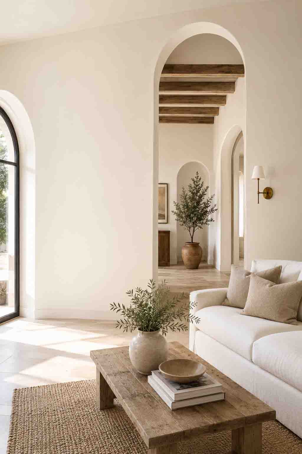
Creamy (SW 7012)
Creamy does exactly what its name promises — it wraps a room in a soft, buttery warmth that feels like candlelight even at noon. It’s the white you choose when crisp modern whites feel too cold and clinical for the mood you’re after.
In a north-facing room, where cooler light can drain the life out of most whites, Creamy holds its warmth beautifully. Pair it with antique woods, aged bronze hardware, and heavy natural textiles for a look that feels collected and old-money rather than brand new.
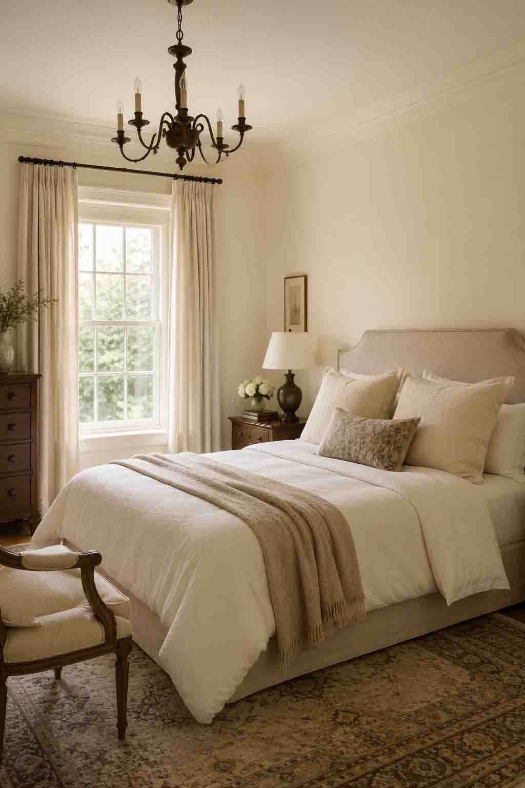
White Duck (SW 7010)
White Duck sits in that coveted space between white and beige — an “almost-white” with real substance. It’s a favorite in the organic modern movement precisely because it looks like natural plaster: soft, earthy, and quietly expensive.
This is one of the best colors on the list for full color-drenching. Walls, trim, ceiling, even built-ins in White Duck create a serene, monolithic envelope that makes a room feel custom-designed. Layer in nubby textures — bouclé, jute, raw wood — and the whole space hums.
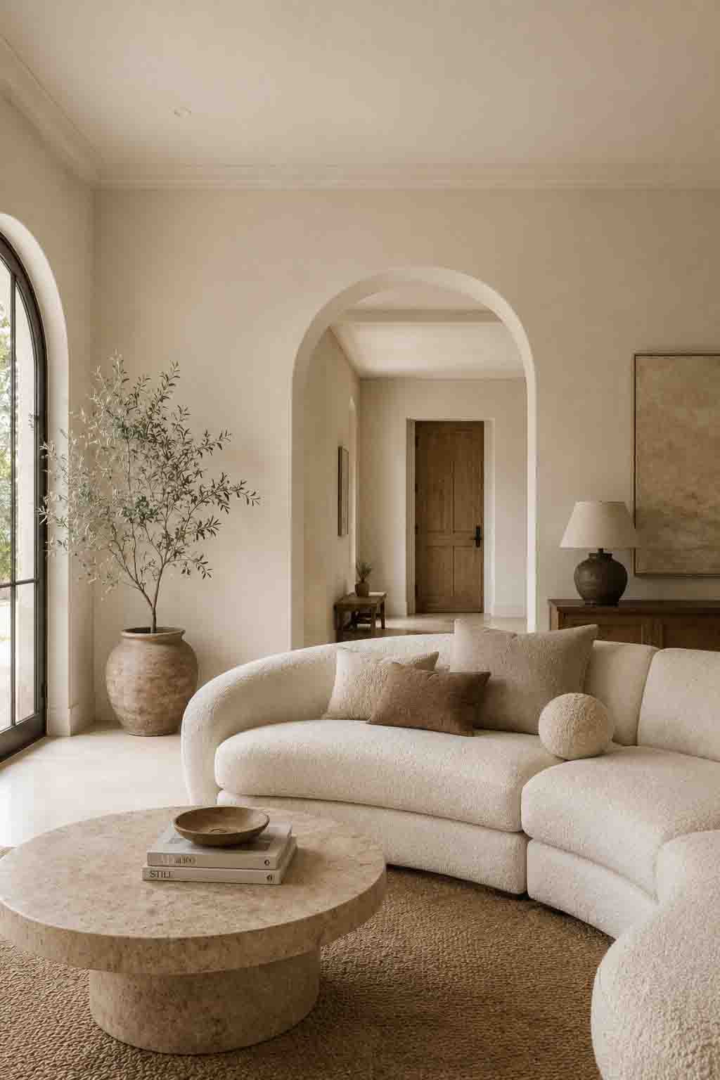
Natural Choice (SW 7011)
Natural Choice is the slightly deeper, more grounded sibling of Creamy — an ivory-leaning off-white that reads calm, warm, and effortlessly refined. It never glows yellow; instead it settles into a soft, natural warmth that flatters skin tones and wood tones alike.
It’s a beautiful cabinetry color for kitchens that want warmth without committing to a true beige, and as a whole-home white it creates that quiet, cohesive flow you feel in professionally designed houses.
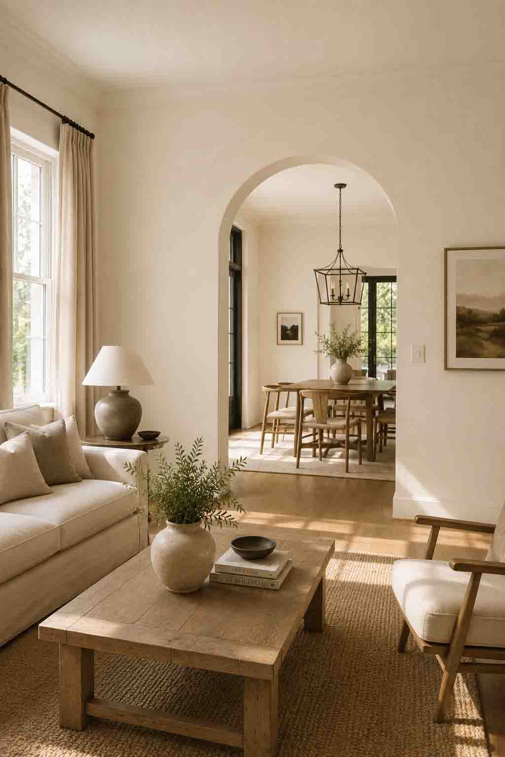
Aesthetic White (SW 7035)
Aesthetic White is what happens when a warm white and a greige have a very tasteful child. It’s light enough to function as a white, but its gray-softened beige base gives it a tailored, dimensional quality that flat whites lack.
It’s a brilliant connector color in open floor plans — sophisticated enough to stand on its own, neutral enough to let adjoining rooms take deeper colors. If your home mixes warm woods with cooler stone or concrete, Aesthetic White bridges them gracefully.

Egret White (SW 7570)
Egret White is one of the most quietly elegant colors Sherwin Williams makes. It’s a greige-white with a soft taupe undercurrent that gives walls a gentle, cashmere-like depth — the kind of color you can’t quite name from across the room, which is precisely what makes it feel expensive.
It’s stunning in primary bedrooms and formal living spaces, especially alongside plaster finishes, ivory drapery, and pale limed oak. Of all the light neutrals on this list, Egret White may be the most “boutique hotel” of them all.
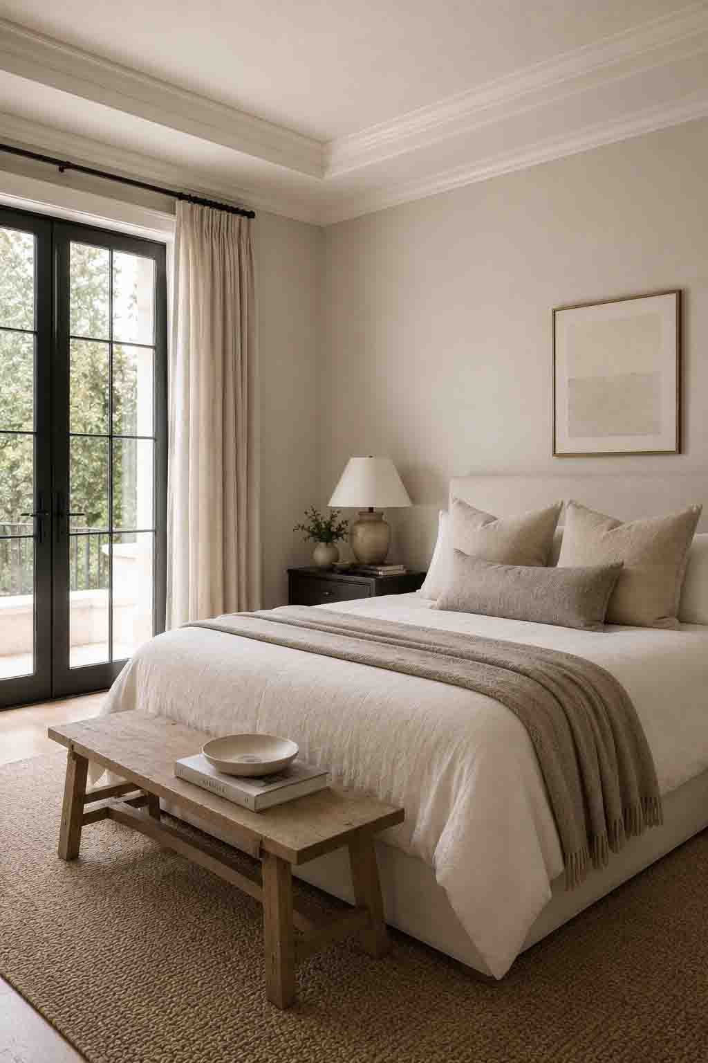
Ivoire (SW 6127)
Ivoire is unapologetically warm — a golden cream that channels old European interiors: Parisian apartments, Tuscan villas, rooms with gilt mirrors and aged patina. In a design world that spent a decade running from yellow undertones, Ivoire is proof that gold, handled well, is the most luxurious undertone of all.
Use it where you entertain. In a dining room under warm dimmed light, Ivoire glows like champagne. Pair it with dark woods, oil-rubbed bronze, and classic millwork for a timeless, heirloom feel.
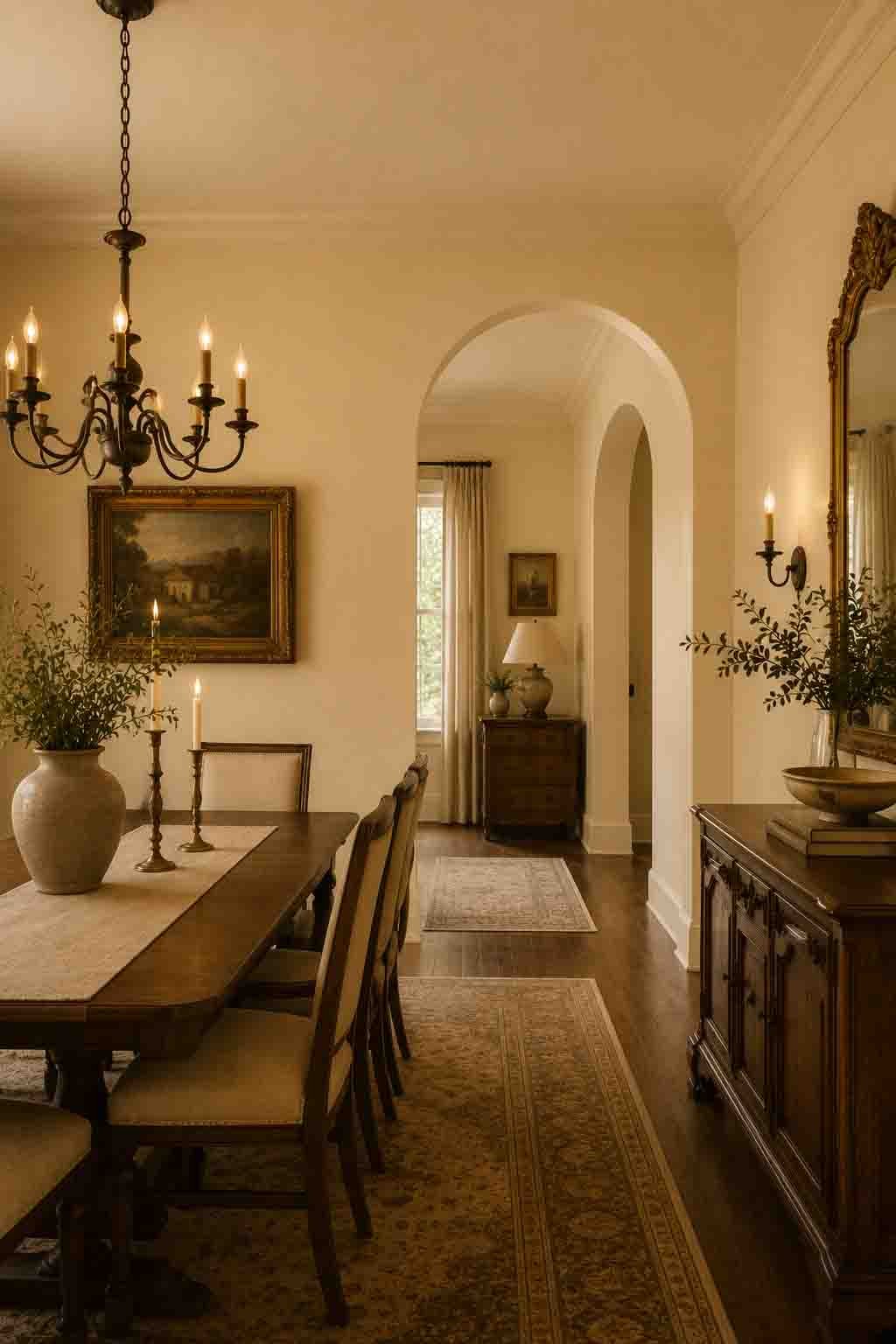
Canvas Tan (SW 7531)
Canvas Tan is one of the cleanest light tans in the Sherwin Williams deck — warm and sandy without slipping into peach or gold. It’s the color of expensive raw canvas and natural linen, which is exactly the vocabulary of coastal-luxury and “new traditional” interiors.
It’s forgiving in almost any light and pairs effortlessly with crisp warm whites on trim. If you want a room that feels bright, warm, and quietly polished with almost zero risk, Canvas Tan is one of the safest luxurious bets on this list.
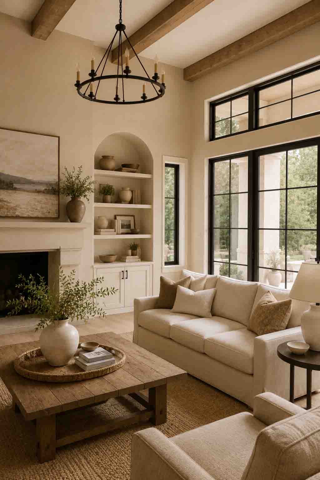
Wool Skein (SW 6148)
Wool Skein is a soft khaki-beige with the faintest green-gray whisper — a color that feels pulled straight from undyed wool and natural fibers. That organic quality is what gives it its quiet sophistication; it never looks synthetic or flat.
It’s beautiful in rooms that connect to the outdoors, where its earthy base plays off greenery through the windows. Pair it with olive tones, warm whites, and woven textures for a grounded, expensive-feeling palette.
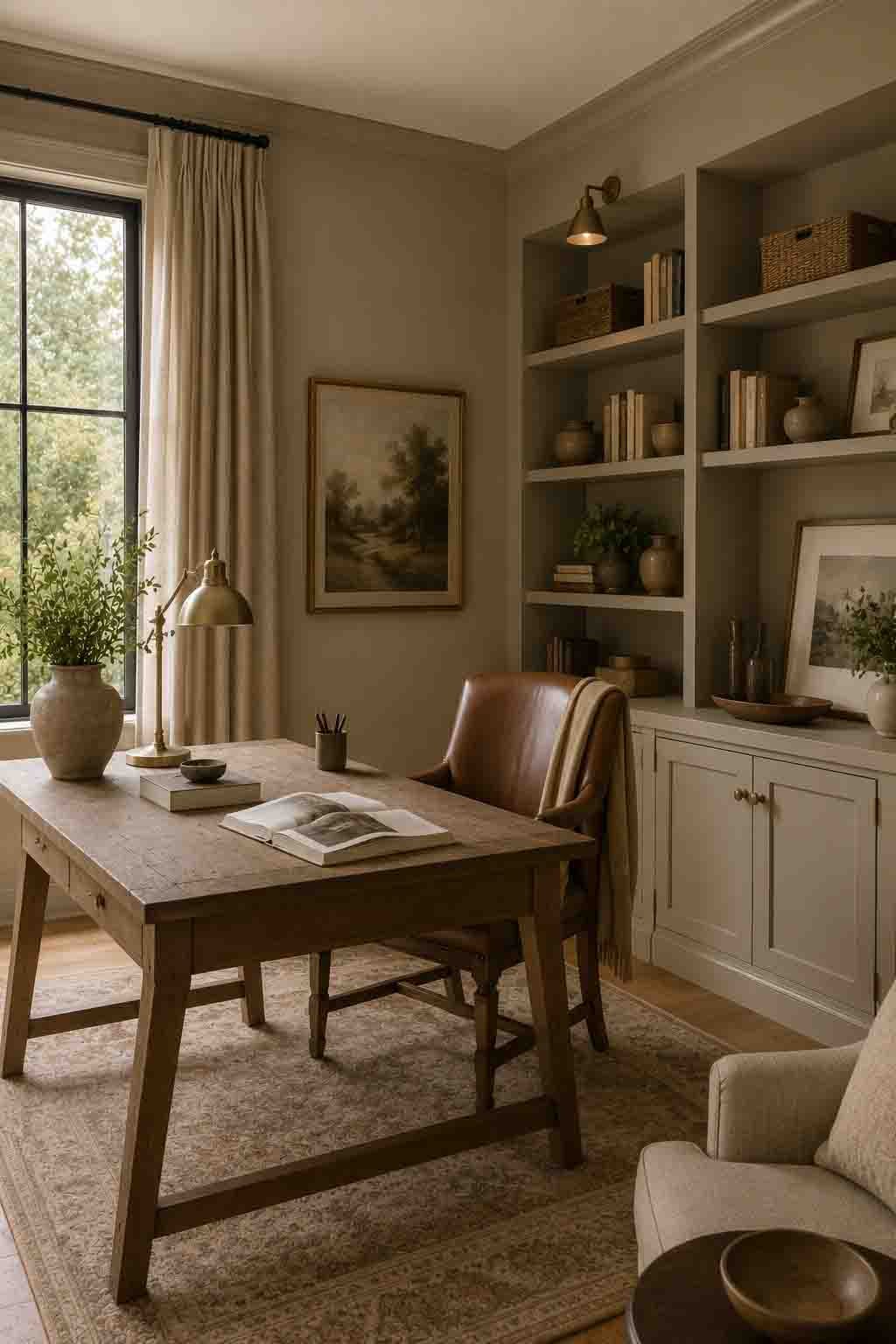
Bungalow Beige (SW 7511)
Bungalow Beige is what builder beige always wished it could be — a warm, balanced beige with enough muting to feel intentional rather than default. It reads as a considered design choice, especially against crisp warm-white trim.
It’s an excellent whole-home neutral for classic and transitional houses: warm enough to feel welcoming, muted enough to sit back and let architecture, art, and furnishings do the talking. That restraint is the essence of a luxurious backdrop.
Perfect Greige (SW 6073)
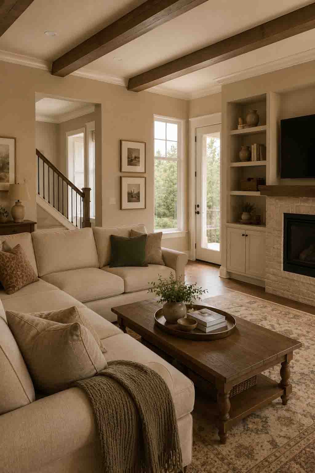
The name isn’t marketing bravado — Perfect Greige genuinely nails the midpoint between gray and beige, with a warm taupe depth that keeps it from ever feeling cold. At an LRV of 51, it has real presence on the wall: this is a color you notice, in the best way.
It’s the shade for a tailored, menswear-inspired room — think camel, charcoal, cognac leather, and brushed brass. Against ivory trim, Perfect Greige delivers the crisp contrast that makes millwork look custom.
Nomadic Desert (SW 6107)
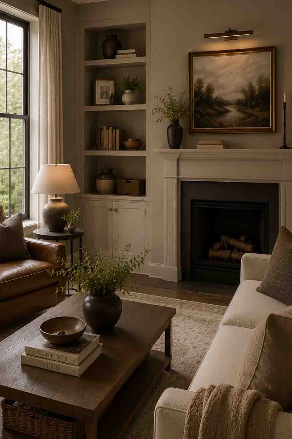
Nomadic Desert is a rich, sun-baked beige with a golden camel depth that instantly evokes high-end desert-modern design — the world of Scottsdale estates, terracotta, and warm limestone. It’s a mid-tone with genuine character.
Use it where you want enveloping warmth with texture: a den with leather seating, a hallway lined with art, a bedroom layered in rust and cream. It pairs beautifully with black-framed windows and warm woods for that curated, rustic-luxe contrast.
Loggia (SW 7506)
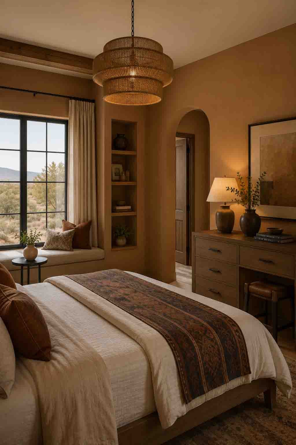
Named after the covered stone galleries of Italian architecture, Loggia carries exactly that mood — aged stone warmed by afternoon sun. It’s a taupe-beige with enough gray to feel sophisticated and enough warmth to stay inviting as light fades.
At LRV 48 it’s a true mid-tone, which makes it wonderful in rooms designed for evenings: libraries, bedrooms, intimate sitting rooms. Layer it with cream linen, dark wood, and soft lamplight, and the room takes on a hushed, five-star quality.
Anew Gray (SW 7030)
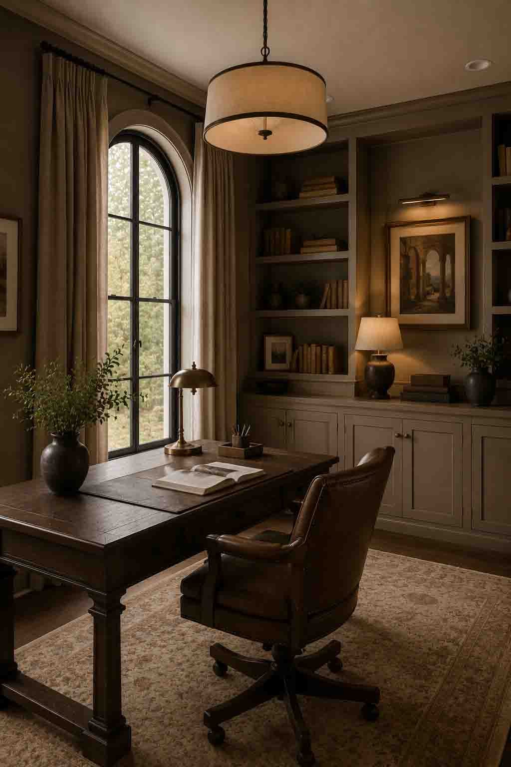
Anew Gray sits one step down the strip from the famously popular Agreeable Gray — same warm greige DNA, but with more saturation and presence. In a bright, high-ceilinged room where lighter greiges wash out, Anew Gray holds its color and gives walls genuine dimension.
That extra depth is what elevates it: paired with bright white trim, it creates the kind of clean, confident contrast you see in high-end model homes and renovation reveals. It’s also a stunning, substantial exterior body color.
Amazing Gray (SW 7044)
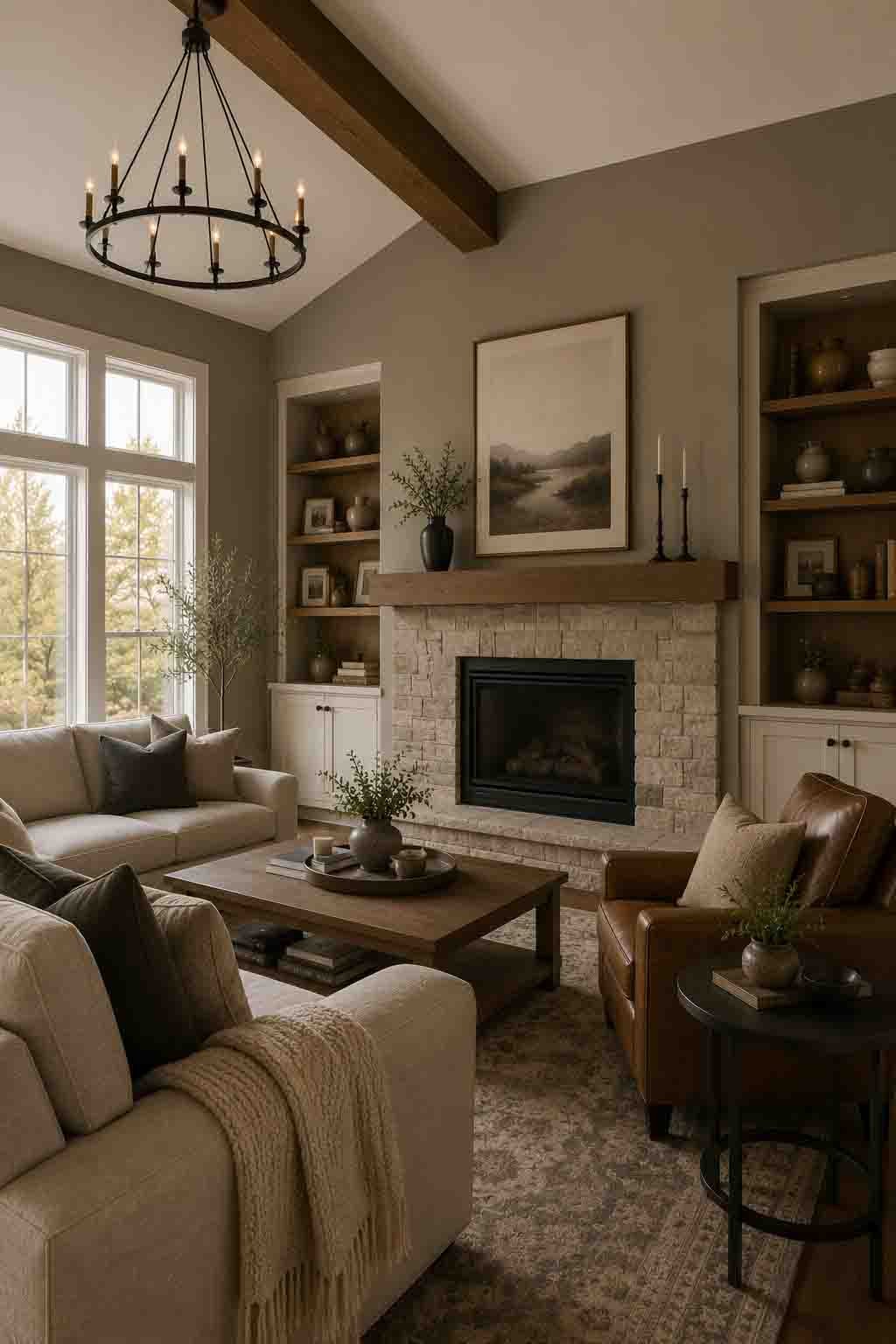
Amazing Gray is the smokier cousin in the warm-greige family — a gray-taupe with a soft, misty quality that feels expensive precisely because it’s so hard to pin down. Is it gray? Taupe? Mushroom? The answer shifts with the light, and that complexity is the luxury.
It’s a beautiful backdrop for a serene, tonal bedroom: layer it with oatmeal, charcoal, and warm white, then add one natural wood element and a touch of black. Understated, calm, and quietly high-end.
Mega Greige (SW 7031)
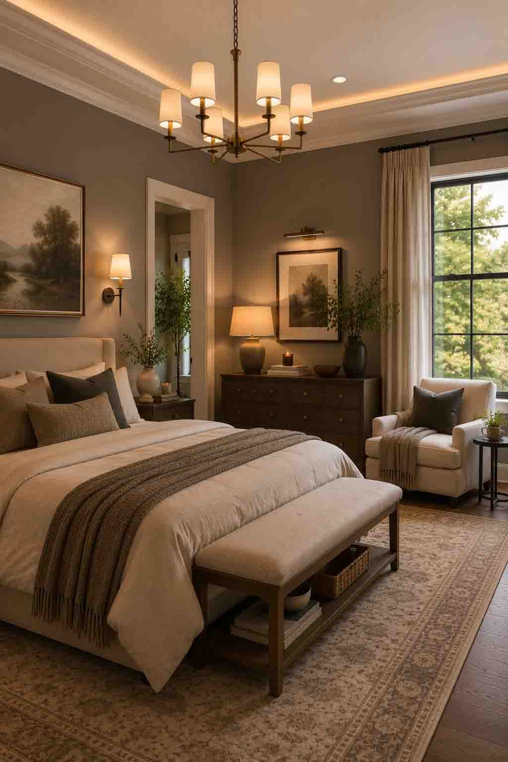
Mega Greige is where the greige family gets serious. At LRV 37 it’s a genuinely deep neutral — earthy, grounded, and rich — and depth is one of the fastest shortcuts to a luxurious feel. Pale walls suggest; deep walls declare.
It’s spectacular on statement millwork: board-and-batten, wainscoting, built-in bookcases, or a full accent wall behind the bed. Against lighter warm neutrals elsewhere in the home, Mega Greige creates the layered, high-contrast palette designers charge good money for.
Urbane Bronze (SW 7048)
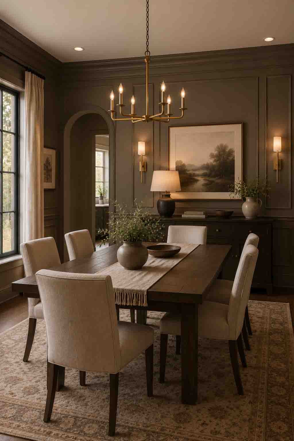
We end with the drama. Urbane Bronze — a former Sherwin Williams Color of the Year — is a deep, smoky gray-brown that proves a “neutral” can be the most striking color in the house. It’s warm at its core, so even at LRV 8 it feels enveloping rather than cold.
This is the color of moody luxury: a color-drenched study, a dramatic dining room, a statement front door, a fireplace wall. Against brass lighting, cream upholstery, and walnut furniture, Urbane Bronze looks like it was specified by a design firm — because in thousands of high-end projects, it was.
How to Combine These Neutrals for a Truly Luxurious Home
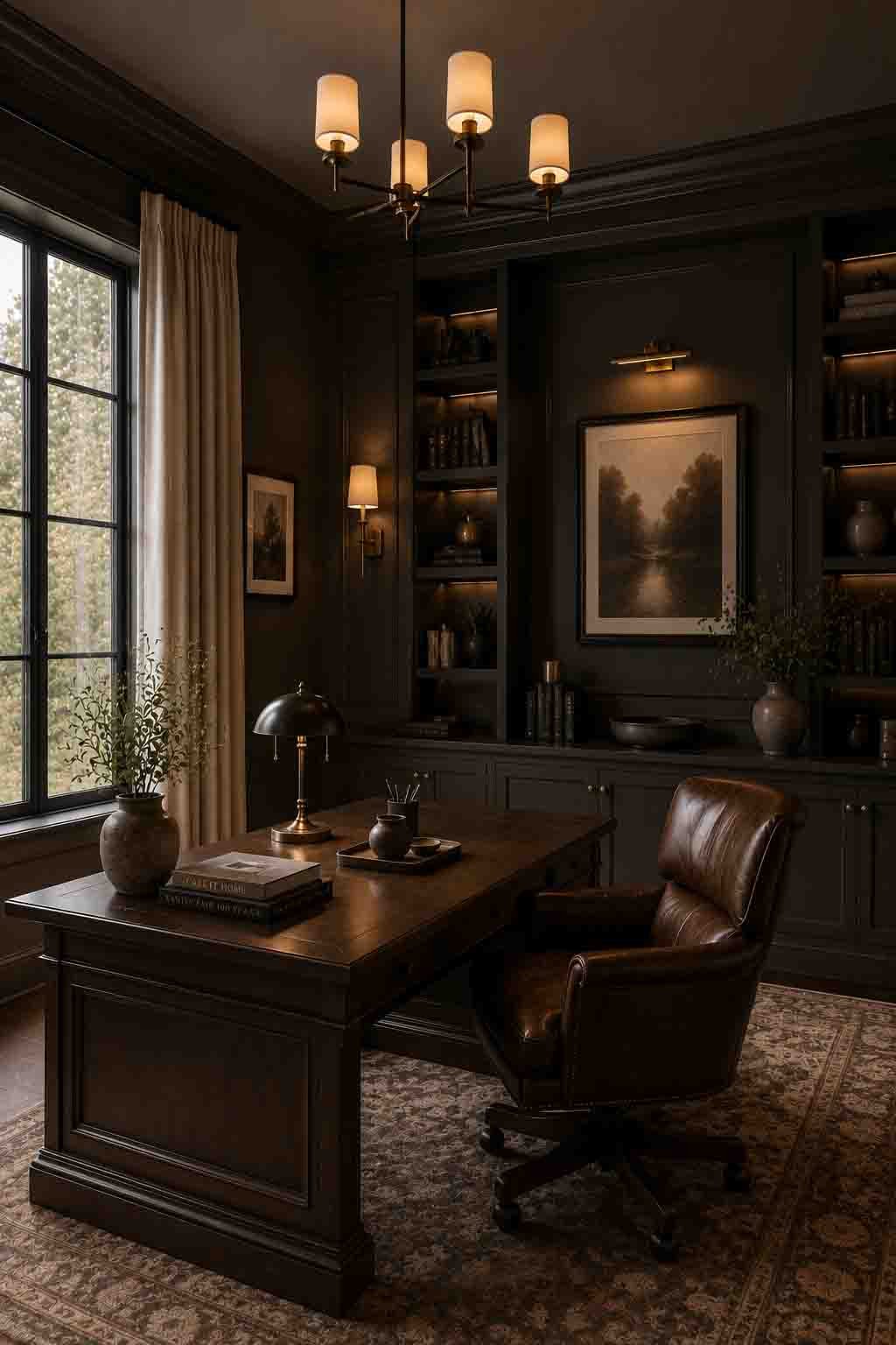
The most expensive-looking homes rarely use just one neutral — they layer three or four from the same warm family. Here’s the simple designer formula:
Choose a warm white foundation. Pick one warm white — Greek Villa, Natural Choice, or Egret White — for trim, ceilings, and your brightest rooms. This becomes the “thread” that ties the whole home together.
Add a mid-tone body color. Select one or two mid-tone neutrals — Canvas Tan, Bungalow Beige, Perfect Greige, or Loggia — for living spaces, bedrooms, and hallways. Keep them in the same undertone family as your white.
Finish with one deep statement. Reserve a deep shade — Mega Greige or Urbane Bronze — for a single high-impact moment: a study, powder room, front door, or built-ins. One dramatic note per home reads curated; five reads chaotic.
Frequently Asked Questions
What paint colors make a house look expensive?
Warm, complex neutrals with subtle undertones — warm whites like Greek Villa, layered greiges like Perfect Greige and Egret White, and deep statement shades like Urbane Bronze. Luxury comes from depth, cohesion, and matte finishes rather than bold color. Flat, one-note colors and shiny wall sheens tend to read cheap.
Which Sherwin Williams warm neutral is best for a whole home?
For a light, gallery-like whole home, Greek Villa or Natural Choice are superb. For a touch more color, Canvas Tan and Bungalow Beige are safe, sophisticated body colors, with Aesthetic White as a lighter greige alternative that flows well between rooms.
Is color-drenching still a luxury trend?
Yes — painting walls, trim, and ceiling in the same shade remains one of the strongest high-end looks. Soft, plaster-like neutrals such as White Duck and Egret White are ideal for a serene drench, while Urbane Bronze delivers the moody, enveloping version in studies and dining rooms.
What trim color goes with these warm neutrals?
Stay in the warm white family. Greek Villa and Natural Choice both make beautiful trim partners for the beiges and greiges on this list. Avoid stark, blue-based bright whites — they clash with warm undertones and can make the wall color look dirty by comparison.
Are warm neutrals more luxurious than grays?
Current design has moved decisively toward warm, organic neutrals. Cool flat grays can read stark and dated, while warm whites, greiges, and taupes add the depth and softness associated with high-end, professionally designed interiors. If you love gray, choose a warm greige like Anew Gray or Amazing Gray to get the best of both.
Final Thoughts: Luxury Is a Feeling, Not a Price Tag
Here’s the beautiful secret of this entire list: a gallon of Greek Villa costs the same as a gallon of the flattest builder beige. The luxurious feel doesn’t come from spending more — it comes from choosing neutrals with depth, keeping undertones cohesive, and layering light, mid, and dark tones with intention.
Whether you fall for the sun-washed calm of Greek Villa, the Italian-stone warmth of Loggia, or the moody confidence of Urbane Bronze, remember the one non-negotiable rule: sample before you commit. Get the undertone right in your light, and your home will feel quietly, unmistakably expensive every single day.
📌 Loved These Colors?
Pin this post to your paint inspiration board so it’s one tap away when you’re ready to sample — and share it with a friend planning their next repaint!